Why does a print look darker than the proof the client approved on screen?
A print that comes back darker than expected is one of the most common print complaints in proofing, and it is rarely the lab's fault. Here is what causes it and how to stop it before the order ships.
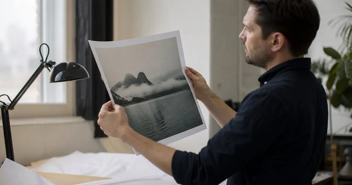
A screen is a light source; a print is not
Every image on a screen is made of light shining directly into the viewer's eye. A print is made of ink on paper that reflects whatever light happens to be in the room. That difference alone explains most of the "my print is too dark" emails. A monitor, and especially a phone, is far brighter than a sheet of paper on a wall, so an image that looks correctly exposed on screen can look noticeably underexposed as a print viewed in ordinary indoor light.
Phones make this worse. Their displays are very bright, they often boost contrast and saturation, and clients look at them in bright rooms or outdoors. A proof that has been favorited entirely on a phone has been judged under the most flattering conditions an image will ever have. The print, hung in a hallway with one lamp, will never match that, no matter how well the lab did its job. Related: Protecting Your Images While Sharing Them
Keep reading: Streamlining Client Proofing After a Shoot, Why Image Numbers Over Email Fail, Setting Client Expectations for Selections. See how Framepickr helps you photographer client proofing galleries with print-order markup.
Your own monitor is part of the problem
If you edit on an uncalibrated monitor at full brightness, you are unconsciously editing darker than you think, because the screen is compensating. When that file goes to the lab, the lab prints what is in the file, not what you saw. The fix is unglamorous: calibrate your editing display with a hardware device, set its brightness to a level appropriate for print work rather than the factory default, and edit in a room with consistent, moderate lighting. Related: How much should a photographer mark up prints ordered through a proofing gallery?
Calibration does not make your screen match the client's screen. Nothing can, because you do not control their device. What calibration does is make your file correct, so that a properly made print from it will look the way you intended under reasonable viewing conditions. Once your side is right, the remaining gap is between the client's phone and the physical print, and that gap is handled by expectation and by test prints, not by editing.
Order a test print before the big order
For any large or expensive print, and for the first order you ever send to a new lab, order a small test print of the same file on the same paper. Look at it in normal room light next to your calibrated screen. If it is darker than you expect, you now know how much to lift the file before the full order, and you know it before the client does. Many labs offer inexpensive test sizes precisely for this reason. Related: How Many Proofs to Show a Client
Paper choice matters here too. Matte and fine art papers absorb more light and have a lower maximum contrast than glossy or metallic surfaces, so the same file will look softer and darker on matte. If a client chooses a matte finish for a moody, low-key portrait, warn them gently that shadow detail will be more subdued than on their screen, and consider a slight lift in the shadows for that specific paper.
Set the expectation inside the proofing gallery
The cheapest fix is a sentence the client reads before they order. Something like: "Prints are viewed by reflected light and will look a little less bright than your phone screen. We adjust every print file for the paper you choose so it looks right on the wall." It is honest, it is reassuring, and it prevents the complaint from forming in the first place. Put it near the print ordering step, not buried in a help page.
Then actually do what the sentence promises. Build a print-specific adjustment into your workflow: after the client approves an image for print, soft-proof it for the chosen paper, lift the midtones or shadows as needed, check the test print if the size warrants it, and only then send the order. A proofing gallery that captures the paper choice with the print order makes this easy, because you know exactly what surface each file is headed for before you touch it. Related: Streamlining Client Proofing After a Shoot
- Screens emit light and prints reflect it, so a print will always look less bright than the same image on a phone.
- Calibrate your editing monitor and lower its brightness so the file itself is correct.
- Order a small test print on the chosen paper before any large or first-time order.
- Tell clients at the ordering step that prints look softer than screens, and adjust each file for its paper.
Julien Jimenez
Julien Jimenez is an independent software builder based in Paris. He designs, ships, and operates focused SaaS products for small businesses and independent professionals. Read the full author page.
Let clients pick their photos without the back and forth
Photographer client proofing galleries with print-order markup. Framepickr is built to help you put this into practice.
Create a galleryMore from the Framepickr blog
Streamlining Client Proofing After a Shoot
Why Image Numbers Over Email Fail

Setting Client Expectations for Selections
Get the Framepickr playbook
Practical guides on photo proofing, straight to your inbox as we publish them. No spam, unsubscribe any time.