What is the best way to present unedited proofs without disappointing the client?
Raw-looking proofs can make a beautiful session feel flat and lead clients to skip images that would have been their favorites once edited. Here is how to show proofs honestly and still get good picks.
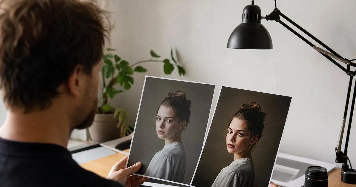
The gap between a proof and a finished image is bigger than clients expect
Photographers look at a flat, unretouched proof and see the finished image underneath it. Clients see a dull, slightly dark picture with a blemish they never noticed in the mirror. That gap is the whole problem. A client who has only ever seen polished images on your website now sees their own session in a state you would never publish, and they quietly conclude that the shoot did not go as well as they hoped. Related: Streamlining Client Proofing After a Shoot
The consequences show up in the picks. Clients skip images that are excellent but need a crop or an exposure lift, favor the frames that happen to look finished straight out of camera, and avoid ordering large prints because nothing looks "print worthy" yet. Every one of those decisions is based on information you did not intend to give them. Presenting proofs well is not about hiding anything. It is about making sure the client is judging the photograph and not the state of the file. Related: How Many Proofs to Show a Client
Keep reading: Streamlining Client Proofing After a Shoot, Why Image Numbers Over Email Fail, Setting Client Expectations for Selections. See how Framepickr helps you photographer client proofing galleries with print-order markup.
Apply a light, consistent base edit to everything
The single most effective step is a quick global pass before proofs go out: white balance, exposure, contrast, and lens correction applied in batch, with the same look across the whole gallery. This takes minutes with a preset and synchronized settings, and it removes the "this looks wrong" reaction without committing you to detailed retouching on images that will never be chosen. The proofs now look like an honest, unfinished version of your style instead of a different photographer's work.
Do not go further than that at the proofing stage. Skin retouching, compositing, and careful local adjustments belong to the selected images only, both because your time is finite and because clients should choose based on the moment and composition rather than on which frames you happened to polish. If a client asks why the proofs look different from your portfolio, the answer is easy: "These are lightly balanced previews. Your selected images get the full edit." Related: Why Image Numbers Over Email Fail
Tell clients what they are looking at, in plain words
Put a short note at the top of the gallery, and repeat it in the delivery email: these are proofs, they are not the final edits, and here is what changes after selection. Be specific. "Selected images will be color corrected, retouched for skin and stray hairs, and cropped for the print size you choose." Clients who know this will happily favorite a frame with a flyaway strand; clients who do not will assume the strand is permanent.
A single before and after pair inside the gallery does more than a paragraph of explanation. Pick one image from their own session, show the proof next to a finished edit, and label them. It takes one extra edit and it recalibrates every judgment they make for the rest of the gallery. It also quietly demonstrates the value of the work they are paying for, which helps later when they are looking at print prices.
Guide attention toward what matters in a proof
Tell clients what to look for. Expression, connection, and composition are what should decide a pick; brightness and color are yours to fix. Phrase it as advice: "Choose the images where the moment feels right. Don't worry about lighting or small details, that's my job." This shifts the client's attention to the things they are actually qualified to judge and away from the things they are not.
Finally, curate hard before the gallery goes live. An unedited proof of a great frame is fine. An unedited proof of a weak frame is a liability, because it looks worse than it is and drags the whole gallery down. Fewer, stronger, lightly balanced proofs with clear expectations will almost always produce a happier client and a better selection than a bigger set of raw exports with a disclaimer. Related: Setting Client Expectations for Selections
- Clients cannot see the finished image inside a flat proof; they judge what is in front of them.
- Batch-apply white balance, exposure, contrast, and lens correction so proofs look like an honest version of your style.
- Label proofs as previews, explain what changes after selection, and show one before-and-after pair.
- Curate tightly and direct the client's attention to expression and composition rather than brightness.
Julien Jimenez
Julien Jimenez is an independent software builder based in Paris. He designs, ships, and operates focused SaaS products for small businesses and independent professionals. Read the full author page.
Let clients pick their photos without the back and forth
Photographer client proofing galleries with print-order markup. Framepickr is built to help you put this into practice.
Create a galleryMore from the Framepickr blog
Streamlining Client Proofing After a Shoot
Why Image Numbers Over Email Fail

Setting Client Expectations for Selections
Get the Framepickr playbook
Practical guides on photo proofing, straight to your inbox as we publish them. No spam, unsubscribe any time.